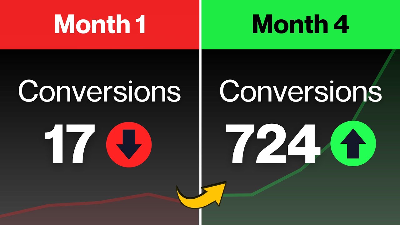
In the digital age, where customers have endless options at their fingertips, businesses face the challenge of standing out in a crowded marketplace. User Experience(UX) has emerged as a game-changer, with its potential to significantly increase conversions.
In this article, we will explore the powerful impact of UX practices increase conversionsand how they can drive businesssuccess. From intuitive navigation to personalized interactions, a seamless user experience can be the key to turning website visitors into loyal customers.
Clear And Compelling Call-to-Action (CTA)
Create a Call-to-Action that NEVER FAILS
A Clear and Compelling Call-to-Action (CTA) is a critical element in UX design, responsible for guiding users toward specific actions, such as making a purchase, subscribing to a newsletter, or signing up for a service. A well-crafted CTA can significantly impact conversion rates and influence user behavior. Here are some essential principles for creating an effective CTA:
Clarity And Visibility
The CTA should be clear and easy to find on the page. Use contrasting colors, bold typography, or buttons to make it visually stand out. Users should immediately recognize the action you want them to take without any confusion.
Action-Oriented Language
Use action-oriented and persuasive language that urges users to act immediately. Phrases like "Buy Now," "Subscribe," "Get Started," or "Download Now" create a sense of urgency and encourage users to take immediate action.
Fulfill User Expectations
Ensure that the CTA aligns with the user's expectations based on their interaction with the website or app. If a user is browsing a product page, the CTA should be related to making a purchase. If they are reading a blog, the CTA could be to subscribe for more content.
Placement And Context
Position the CTA where users are most likely to notice it. Consider placing it above the fold or at the end of a persuasive section. Additionally, the CTA's context should complement the content around it, so it feels like a natural continuation of the user's journey.
Mobile-Friendly Design
With an increasing number of users accessing websites through mobile devices, it's essential to create mobile-friendly CTAs. Ensure that they are large enough and easily clickable on smaller screens to avoid frustration.
Test And Iterate
A/B testing is crucial for optimizing your CTA's performance. Run experiments with different wording, colors, or placements to identify which variation drives the highest conversions. Regularly analyze data and user feedback to refine your CTA and continuously improve its effectiveness.
Offer Value
Provide users with a clear benefit or value proposition when they click on the CTA. Whether it's a discount, a free trial, or access to exclusive content, offering something of value increases the likelihood of conversion.
Simplified And Intuitive Navigation

11 UX Tips for Successful Navigations (in 7 minutes!)
Simplified and Intuitive Navigation is a fundamental aspect of User Experience (UX) design that directly impacts how users interact with a website or app. When navigation is clear, straightforward, and easy to use, users can find what they're looking for quickly, leading to improved engagement and increased conversions. Here are essential principles for achieving simplified and intuitive navigation:
Limit The Number Of Menu Items
Avoid overwhelming users with an extensive list of menu items. Keep the main navigation menu concise and focused on essential pages or categories. A cluttered menu can confuse users and make it harder for them to find what they need.
Use Clear And Descriptive Labels
Label navigation items with clear and descriptive wording that accurately represents the content or purpose of each page. Avoid using jargon or ambiguous terms that might confuse users. Use language that users are familiar with and understand.
Prioritize Important Pages
Place the most critical and frequently accessed pages in prominent positions within the navigation menu. For example, the "Home" page, "Products" or "Services" page, and "Contact" page should be easily accessible. Secondary pages can be grouped under relevant main categories or in dropdown menus.
Consistent Placement And Design
Keep the navigation menu in a consistent location throughout the website or app. Users expect to find the menu at the top or side of the page. Consistency in design, such as font style, color, and spacing, also helps users quickly recognize the navigation elements.
Breadcrumb Navigation
Implement breadcrumb navigation to show users their current location within the website's hierarchy. Breadcrumbs provide a trail of links that lead back to the homepage or parent category, helping users easily backtrack or navigate to higher-level pages.
Search Functionality
Incorporate a search bar prominently within the navigation area to allow users to search for specific content. This is especially helpful for websites with a vast amount of information or products.
User-Friendly Dropdown Menus
If using dropdown menus, ensure they are user-friendly and easy to navigate. Avoid overcrowding dropdowns with too many options and use clear headings to group related items.
Mobile Responsiveness
Ensure that the navigation design is responsive and adapts seamlessly to different screen sizes, especially on mobile devices. Mobile users should be able to access and navigate the website effortlessly.
User Testing And Feedback
Conduct usability testing and gather feedback from real users to identify any pain points or areas of confusion in the navigation. Use this data to make informed improvements and refine the navigation experience.
Optimized Page Load Speed

How to Optimize Your Page Loading Speed | The Journey
Optimized Page Load Speed is a crucial aspect of User Experience (UX) that directly impacts user satisfaction and website performance. In today's fast-paced digital world, users have little patience for slow-loading websites. Studies have shown that even a slight delay in page load time can lead to higher bounce rates and decreased conversions. To ensure a positive UX and drive better businessoutcomes, here are essential practices for optimizing page load speed:
Optimize Images And Multimedia
Images and multimedia content can significantly contribute to page load time. Compress images without sacrificing quality and use appropriate file formats (e.g., JPEG for photographs, PNG for graphics). Consider lazy loading images, which load images only as users scroll down the page, reducing the initial load time.
Minimize HTTP Requests
Reduce the number of HTTP requests by combining CSS and JavaScript files and using CSS sprites for multiple images. Fewer requests mean quicker loading times.
Leverage Browser Caching
Set up browser caching to store static resources on users' devices temporarily. When users revisit the website, their browsers can retrieve these resources from the cache instead of fetching them from the server again, reducing load time.
Enable Compression
Enable Gzip or Brotli compression to compress your website's files before they are sent to the user's browser. Compressed files are smaller, leading to faster data transfer and reduced load time.
Reduce Server Response Time
Optimize server response time by using a reliable hosting provider, employing caching strategies, and minimizing the processing time of dynamic content generation.
Prioritize Above-the-Fold Content
Load critical above-the-fold content first to provide users with a faster initial view of the page. This way, users can start engaging with the content while the rest of the page loads in the background.
Minify CSS, JavaScript, And HTML
Remove unnecessary spaces, comments, and line breaks from CSS, JavaScript, and HTML files to reduce their size. Minifying these files results in faster downloads and improved page load speed.
Use Content Delivery Networks (CDNs)
Utilize CDNs to distribute your website's static resources across multiple servers worldwide. This reduces the physical distance between the user's browser and the server, resulting in faster load times.
Optimize Mobile Performance
Pay special attention to mobile performance since more users access websites from mobile devices. Prioritize mobile responsiveness and consider mobile-specific optimizations to cater to this audience.
Regularly Monitor And Test
Regularly monitor your website's performance using tools like Google PageSpeed Insights or Lighthouse. Conduct speed tests from various locations and devices to identify bottlenecks and areas for improvement. Continuously optimize and test to ensure optimal load times.
Mobile-Friendly And Responsive Design

The Secret to be Mobile Friendly in 10 Minutes | Truly Responsive Web Design
Mobile-friendly and Responsive Design is a fundamental UX practice that ensures websites and applications provide an optimal viewing and interaction experience across a wide range of devices, including smartphones, tablets, and desktops. In an era where mobile usage has surpassed desktop usage, having a mobile-friendly and responsive design is crucial for user satisfaction and business success. Here are the key principles and benefits of mobile-friendly and responsive design:
Principles Of Mobile-Friendly And Responsive Design
- Flexible Layouts -Use fluid grids and flexible layout structures that adjust and adapt to different screen sizes. Elements should scale proportionally, providing a seamless experience on various devices.
- Viewport Meta Tag -Include the viewport meta tag in the HTML to ensure that the page's width is set to match the device's screen width. This helps prevent content from being too large or too small on different devices.
- Touch-Friendly Interactions -Optimize interactions for touchscreens by ensuring buttons and links have enough space to be easily tapped with a finger. Avoid relying solely on hover interactions, which do not work on touch devices.
- Readable Typography -Use legible fonts and font sizes that are easily readable on smaller screens. Maintain adequate line spacing and avoid long blocks of text to improve readability.
- Optimized Images -Deliver images that are appropriately sized for different devices to reduce page load times. Use responsive image techniques, such as srcset and sizes attributes, to serve the most appropriate image resolution.
Benefits Of Mobile-Friendly And Responsive Design:
- Enhanced User Experience -Users can seamlessly access and interact with your website or app on any device, leading to higher satisfaction and engagement.
- Improved SEOPerformance -Google prioritizes mobile-friendly websites in search rankings, so having a responsive design can positively impact your website's SEOperformance.
- Increased Conversion Rates -A user-friendly mobile experience encourages users to stay longer and convert more frequently, leading to higher conversion rates.
- Consistent Branding-A responsive design ensures that your brand's look and feel remain consistent across all devices, reinforcing brand recognition and trust.
- Cost and Time Efficiency -Maintaining a single responsive website is more cost-effective and time-efficient than developing separate websites for different devices.
Social Proof And Trust Signals

What is Social Proof? (and why your website needs it)
Social Proof and Trust Signals are powerful UX practices that can significantly influence user behavior and increase conversions. In today's digital age, where consumers have numerous options at their disposal, building trust and credibility is essential for businesses. Social proof and trust signals play a crucial role in instilling confidence in users and encouraging them to take action. Let's explore these practices in detail:
Social Proof
Social proof is a psychological phenomenon where people look to others' actions and experiences to determine their own behavior. In the context of UX design, social proof can be incorporated in various forms, such as:
- Customer Reviews and Testimonials -Displaying genuine reviews and testimonials from satisfied customers can provide reassurance to potential buyers. Positive feedback from others helps build trust and confidence in the product or service.
- User Ratings and Reviews -Implementing a rating system that allows users to rate products or services enables potential customers to gauge their popularity and quality based on others' experiences.
- Case Studiesand Success Stories -Showcasing real-life case studies or success stories can demonstrate how your product or service has positively impacted customers, further establishing credibility.
- Social MediaValidation -Highlighting the number of followers, likes, or shares on social media platforms can signal popularity and engagement, reinforcing your brand's authority.
- Influencer Endorsements -Collaboration with influencersor industry experts who endorse your brand can add authenticity and credibility to your offerings.
Trust Signals
Trust signals are elements or indicators on a website that communicate security, reliability, and authenticity. They help users feel safe and confident when engaging with a website or making a purchase. Common trust signals include:
- Security Badges and SSL Certificates -Display trust seals, SSL certificates, or security badges, especially on checkout pages, to assure users that their sensitive information is protected.
- Privacy Policy and Terms of Service - Including clear and comprehensive privacy policies and terms of service instills confidence in users that their data will be handled responsibly.
- Contact Information and Customer Support -Providing easy-to-find contact information and customer support options demonstrates transparency and accessibility, allowing users to seek assistance if needed.
- Money-Back Guarantee or Return Policy -Offering a money-back guarantee or a hassle-free return policy shows that you stand behind your product or service and are willing to address any customer concerns.
- Third-Party Certifications -Showcasing certifications, awards, or affiliations with reputable organizations can enhance your credibility and legitimacy.
A/B Testing And Data-Driven Iteration

How to Run an SEO A/B Test [Template Included]
A/B Testing and Data-Driven Iteration are essential components of an effective User Experience (UX) optimization strategy. These practices enable businesses to make informed decisions based on real user data, leading to improved website performance, higher conversion rates, and overall business success. Let's delve into A/B testing and data-driven iteration and understand their significance in UX design:
A/B Testing
A/B testing, also known as split testing, involves comparing two versions (A and B) of a webpage or app element to determine which performs better in terms of user engagement and conversions. Here's how it works:
- Hypothesis -Start by formulating a hypothesis about a particular element you want to test. It could be a different CTA button color, layout variation, or headline text.
- Variations -Create two versions of the element, with one being the control (A) and the other the variation (B). Both versions should differ in only one aspect, the one you want to test.
- Random Sampling -Randomly divide your website's traffic or user base between the two variations to ensure a fair comparison.
- Data Collection - Monitor user behavior and interactions with both versions, such as click-through rates, conversions, or time spent on the page.
- Analysis -Analyze the data collected to determine which variation performed better in achieving your goals.
- Implementation -Based on the results, implement the winning variation, which is the one that showed better performance.
Data-Driven Iteration
Data-driven iteration involves using data and user feedback to continuously improve and optimize the UX design. Here's how toapply data-driven iteration:
- Collect Data -Utilize various analytics tools to gather quantitative data, such as user behavior, conversion rates, bounce rates, and session duration. Also, collect qualitative data through surveys, user interviews, and usability testing to gain insights into users' experiences and pain points.
- Analyze Data -Interpret the data to identify areas for improvement and patterns that indicate potential issues or opportunities.
- Identify Priorities:Based on the data analysis, prioritize the UX elements or pages that require attention and enhancement.
- Implement Changes - Make data-driven changes to the identified elements, such as revising page layouts, optimizing CTAs, or simplifying navigation.
- Monitor Results -After implementing changes, closely monitor the impact on user behavior and conversions. Compare the results to the previous data to assess the effectiveness of the changes.
- Iterate Again - Continue the process of data collection, analysis, and iteration in a cyclical manner. Keep refining the UX design based on user feedback and data insights.
People Also Ask
What Is User Experience (UX)?
User Experience (UX) refers to the overall experience that users have while interacting with a website, application, or product. It encompasses various aspects such as usability, accessibility, design, and user satisfaction. A good UX design focuses on creating a seamless and enjoyable experience for users, ultimately leading to increased engagement and conversions.
Why Is User Experience Important For A Website?
User Experience is crucial for a website because it directly impacts user satisfaction and engagement. A positive UX can lead to longer user sessions, lower bounce rates, and increased conversions. A well-designed website that is easy to navigate and visually appealing encourages users to stay longer, explore more, and ultimately become loyal customers.
How Can I Improve The User Experience Of My Website?
Improving the User Experience of your website involves several practices, including:
- Conducting user research and understanding your target audience.
- Simplifying website navigation and providing clear calls to action.
- Optimizing page load speed to reduce waiting times.
- Ensuring responsive and mobile-friendly design for seamless access across devices.
- Regularly testing and analyzing user behavior to make data-driven improvements.
What Is The Difference Between User Experience (UX) And User Interface (UI)?
User Experience (UX) and User Interface (UI) are related but distinct concepts. UX focuses on the overall experience and satisfaction of users when interacting with a product or service. It considers factors like ease of use, accessibility, and emotional responses. On the other hand, UI refers specifically to the visual elements and design of the product or interface, including layout, colors, typography, and interactive elements.
How Does User Experience Impact SEO?
User Experience has become an important factor in search enginerankings. Search engines like Google prioritize websites that offer a positive user experience, as it indicates relevance and quality to users. Factors such as page load speed, mobile-friendliness, and low bounce rates contribute to a website's SEOperformance.
Conclusion
User Experience is no longer an optional aspect of website design but a critical determinant of business success. By adopting UX practices that prioritize the needs and preferences of users, companies can create a compelling digital experience that converts visitors into loyal customers. From optimizing page load speeds to crafting persuasive CTAs, each UX element plays a crucial role in shaping the user journey.
As businesses continue to embrace data-driven decision-making and prioritize user-centricity, they will undoubtedly reap the rewards of increased conversions, customer satisfaction, and long-term growth in today's competitive digital landscape. Remember, investing in UX is an investment in the future success of your business.