In today's digital age, having a responsive website is no longer a luxury, but a necessity. The increasing use of mobile devices to access the internet has made it crucial for businesses to optimize their websites for various screen sizes. This is where responsive web design comes into play. But what is the importance of considering SEO responsive web design benefits?
The Importance Of Considering SEO Responsive Web Design Benefits
Responsive web design (RWD) is a web design approach that ensures a website's layout and contentadapt seamlessly to different screen sizes, such as desktops, tablets, and smartphones. RWD not only provides an optimal user experiencebut also has numerous SEObenefit
Responsive web design (RWD) has become a standard practice in website developmentdue to the increase in mobile device usage. With more and more users accessing websites on mobile devices, it's important to ensure that your website is responsive to provide an optimal user experience.
However, responsive web design not only improves user experience but also provides several SEObenefits that can improve your search enginerankings. Let's talk about the top 8 SEOresponsive web design benefits in detail.
Improved User Experience
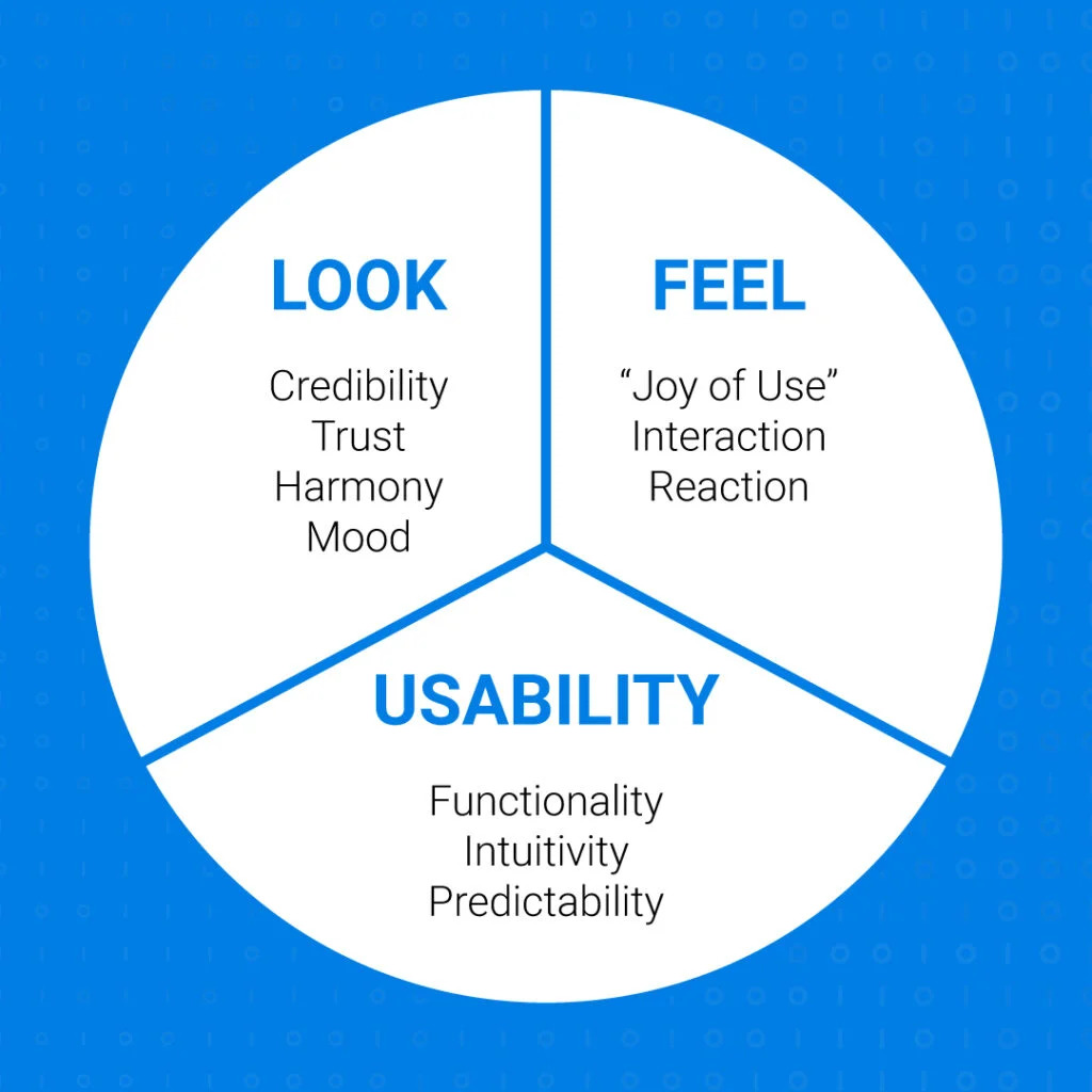
One of the primary benefits of RWD is that it provides an improved user experience (UX) across all devices. With a responsive website, users don't have to pinch, zoom, or scroll horizontally to view content on their mobile devices, which can be frustrating and time-consuming.
A positive user experience leads to longer dwell times, lower bounce rates, and higher engagement, all of which can improve your search engine rankings.
For example, let's say you run an e-commerce website, and a user visits your site on their mobile device to make a purchase. If your website is not responsive, the user may have difficulty navigating the site, leading to frustration and a higher likelihood of leaving your site without making a purchase.
However, with a responsive website, the user can easily navigate the site, find the product they're looking for, and complete the purchase, resulting in a positive user experience and potentially higher conversion rates.
Faster Page Load Speeds
Page load speed is a critical ranking factor for search engines, and it's even more important for mobile users who are often on slower internet connections. With a responsive website, you can optimize your site's load speed across all devices, leading to faster load times and improved user experience.
For example, let's say a user visits your website on their mobile device and the site takes too long to load. The user may become frustrated and leave your site, resulting in a higher bounce rate.
However, with a responsive website, you can optimize your site's load speed for mobile devices, resulting in faster load times and a better user experience.
Lower Bounce Rates
A responsive website can also help lower your bounce rates. When users visit your site and have a positive user experience, they're more likely to stay on your site longer, visit more pages, and convert.
Conversely, if users have a poor experience on your site, they'll likely leave quickly, resulting in a higher bounce rate. A lower bounce rate can signal to search engines that your site is providing valuable content to users.
For example, let's say a user visits your website on their mobile device and has a positive user experience. The user may spend more time on your site, visit more pages, and potentially make a purchase. This can signal to search engines that your site is providing valuable content to users, resulting in higher search engine rankings.
Improved Mobile Search Rankings
In 2015, Google introduced a mobile-friendly algorithm update that gave priority to mobile-friendly sites in mobile search results. Since then, having a responsive website has become even more critical for mobile search rankings.
With a responsive website, you can improve your chances of ranking higher in mobile search results, which can drive more traffic to your site.
For example, let's say a user searches for a keyword related to your businesson their mobile device. If your website is not responsive, it may not rank as high in mobile search results, resulting in lower traffic to your site. However, with a responsive website, your site is more likely to rank higher in mobile search results, resulting in more traffic to your site.
Consolidated URL Structure
Having a responsive website means that you only have one URL for all devices, which makes it easier for search engines to crawl and index your site. This can lead to better search engine visibility and improved rankings.
When you have a separate mobile site, you may have a different URL structure for your mobile site and your desktop site, which can confuse search engines and make it harder for them to understand the relationship between the two sites. This can result in lower search engine visibility and rankings for both sites.
With a consolidated URL structure, you can avoid this issue and ensure that your site is optimized for search engine crawling and indexing. This means that your site is more likely to appear in search engine results pages (SERPs) and that you can potentially drive more organic traffic to your site.
For example, if you have a desktop site with the URL "www.example.com" and a mobile site with the URL "m.example.com," search engines may not understand that the two sites are related.
However, if you have a responsive site with the URL "www.example.com," search engines can easily recognize that your site is designed to work on all devices and will be more likely to include your site in their search results.
In addition to improving your search engine visibility, having a consolidated URL structure can also make it easier for users to navigate your site. When users share links to your site, they can simply share the same URL regardless of the device they're using, which can improve the overall user experience and potentially drive more traffic to your site.
Reduced Duplicate Content
Having duplicate content on your website can be detrimental to your search engine rankings. When you have a separate mobile website, you may be duplicating your content, which can harm your rankings. This is because search engines may not know which version of the content to index, leading to confusion and potentially lower rankings.
However, with a responsive website, you have only one set of content that adapts to different screen sizes. This means that there is no need to duplicate content across multiple versions of your site. By reducing the risk of duplicate content, you can help to improve your search engine rankings and avoid any potential penalties.
For example, let's say you have a mobile version of your website with a separate URL (m.example.com). If you have the same content on both your desktop and mobile sites, search engines may see this as duplicate content. However, with a responsive website, you have only one URL, and the same content adapts to different devices.
Improved Social Sharing
Social sharing is an essential aspect of any online marketing strategy. When users share your content on social media, it can help to increase your website's visibility and attract more traffic to your site. With a responsive website, users can easily share your content on social media, regardless of the device they're using.
This is because a responsive website adapts to different screen sizes, making it easy for users to read and share your content on their mobile devices. This can lead to more social shares, which can help to improve your search engine rankings.
For example, let's say a user is browsing your website on their mobile device and comes across an interesting article. If your website is not mobile-friendly, the user may have difficulty reading the article or sharing it on social media.
However, with a responsive website, the user can easily read and share the article on their mobile device, increasing the chances of social shares and improving your rankings.
Lower Maintenance Costs
Maintaining a separate mobile website can be expensive and time-consuming. With a responsive website, you only have to maintain one site, which can save you time and moneyin the long run.
This is because you don't have to create and maintain two separate versions of your site, each with its own design, content, and URL structure.
Instead, with a responsive website, you can have one set of content that adapts to different screen sizes. This means that you can make changes and updates to your website more easily, without having to worry about maintaining multiple versions of your site.
For example, let's say you want to update the design of your website. If you have a separate mobile website, you would have to update both your desktop and mobile versions separately. However, with a responsive website, you only have to make one set of design changes, and they will automatically apply to all devices, saving you time and money.

Responsive Web Design provides 5 important SEO benefits
People Also Ask
Can A Responsive Website Improve Conversion Rates?
Yes, a responsive website can improve conversion rates by providing a positive user experience, reducing bounce rates, and making it easier for users to engage with your content and complete desired actions, such as filling out a form or making a purchase.
How Can Businesses Measure The Impact Of Responsive Web Design On Their SEO?
Businesses can measure the impact of responsive web design on their SEO by tracking metrics such as website traffic, bounce rates, dwell times, and search engine rankings across different devices.
Are There Any Downsides To Using Responsive Web Design For SEO?
While responsive web design can provide many benefits for SEO, it may not be the best option for every website. Some downsides to using responsive web design for SEO include longer load times on slower devices, potentially more complex coding requirements, and the need to ensure that all content and features are optimized for all device types.
Conclusion
In conclusion, SEO responsive web design benefits are not just important for providing an optimal user experience, but also for improving your search engine rankings. By adopting a responsive design approach, you can improve your site's load speed, reduce bounce rates, improve mobile search rankings, and lower maintenance costs. So if you haven't already, it's time to make your website responsive and reap the benefits.