In the rapidly evolving digital landscape, having a strong online presence is paramount for businesses and individuals alike. Search engine optimization(SEO) has emerged as a crucial aspect of achieving visibility and success in the virtual world. In this article, we will delve into the manifoldSEO benefits of responsive web designand explore how it can significantly enhance a website's SEOperformance. With the ubiquitous usage of mobile devices, responsive web design has become a game-changer in the quest for better SEOrankings.
What Is Responsive Web Design?
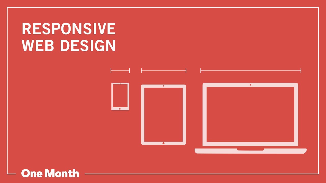
What is Responsive Web Design?
Responsive web design (RWD) is an approach to web development that aims to create websites capable of providing optimal viewing and user experienceacross various devices and screen sizes. The primary goal of responsive web design is to ensure that a website's layout and elements automatically adjust and adapt to different devices, such as desktop computers, laptops, tablets, and smartphones.
In traditional web design, separate versions of a website were often created for different devices. For example, a desktop version and a mobile version might have existed side by side, leading to potential issues with managing and updating contenton multiple platforms. However, responsive web design utilizes a single codebase and set of content to deliver a consistent and user-friendly experience to visitors, regardless of the device they use to access the site. Key features of responsive web design include:
- Fluid Grids -Instead of fixed-width layouts, responsive web design uses fluid grids that adjust and scale based on the screen size, ensuring that content displays correctly on various devices.
- Flexible Images -Images in responsive designs are also flexible, meaning they can resize and adapt according to the screen's dimensions without losing quality or aspect ratio.
- Media Queries -CSS media queries are employed to apply different styles and rules based on the characteristics of the user's device, such as screen size, resolution, and orientation.
- Mobile-First Approach -Often, designers adopt a mobile-first approach, creating the website's design and layout primarily for mobile devices and then scaling it up for larger screens.
- User Experience (UX) Considerations -Responsive web design focuses on providing an excellent user experience, with easy-to-use navigation, readable fonts, and intuitive interaction elements on all devices.
What Are The Key Principles Of Web Design?

KEY Web Design Principles: Navigation, Hierarchy & Color
The key principles of web design encompass various elements and considerations that contribute to creating visually appealing, user-friendly, and effective websites. These principles help designers and developers ensure that websites are engaging, accessible, and functional for visitors. Here are the fundamental key principles of web design:
- User Interface (UI) Design -UI design focuses on creating an intuitive and user-friendly interface that allows visitors to navigate the website with ease. Clear and well-organized navigation menus, buttons, and interactive elements contribute to a positive user experience.
- Visual Hierarchy- Establishing a visual hierarchy involves organizing content and design elements in a way that guides users' attention through the page. Important information should stand out prominently, making it easy for visitors to grasp the website's main message and offerings.
- Responsive Design -With the diverse range of devices and screen sizes used to access the web, responsive design is crucial. A responsive website adapts its layout and content to fit various screen resolutions, providing a consistent and optimized experience for users across all devices.
- Consistency -Maintaining consistency in design elements is essential for creating a cohesive and professional-looking website. Consistency in typography, color schemes, buttons, and overall style throughout the site enhances brand identity and user familiarity.
- Loading Speed Optimization -Web users have little patience for slow-loading websites. Optimizing loading speed by compressing images, minifying code, and leveraging browser caching is crucial for reducing bounce rates and enhancing user satisfaction.
- Accessibility -Web design should be inclusive and accessible to all users, including those with disabilities. Designers should consider factors like text alternatives for images (alt text), keyboard navigation, and compatibility with screen readers to ensure a barrier-free experience.
- Whitespace and Content Prioritization - Using whitespace strategically helps create a clean and uncluttered design. It also aids in content prioritization, making important elements stand out and ensuring that the website's message is communicated effectively.
- Typography -Carefully selecting fonts and font sizes is vital for readability and establishing the website's tone and personality. A well-chosen typography style enhances the overall user experience.
- Cross-Browser Compatibility -Websites should be tested and optimized to function correctly across different web browsers (such as Chrome, Firefox, Safari, and Edge) to ensure a consistent experience for all users.
- Mobile-Friendly Design -As mobile usage continues to grow, designing for mobile devices is crucial. The mobile-friendly design ensures that the website is easily accessible and functional on smartphones and tablets.
- Call-to-Action (CTA) Placement -Strategically placing clear and compelling calls-to-action throughout the website encourages users to take specific actions, such as making a purchase, signing up for a newsletter, or contacting the company.
Improved User Experience (UX)

UX/UI BEST PRACTICES FOR WEB DESIGN: Free Web Design Course | Episode 12
Improved user experience (UX) is one of the most significant benefits of responsive web design. UX refers to the overall experience that a user has when interacting with a website or digital product. A positive user experience is crucial for the success of any website, as it directly impacts user satisfaction, engagement, and conversion rates. Here's how responsive web design contributes to an improved user experience:
- Consistent Experience Across Devices -With responsive web design, users get a consistent and seamless experience regardless of the device they use. Whether they access the site on a desktop, laptop, tablet, or smartphone, the layout and content adapt to fit the screen size, ensuring readability and usability.
- Easy Navigation -Responsive design simplifies navigation on various devices. Users can access menus, links, and interactive elements without any difficulty, eliminating the need for horizontal scrolling or zooming in and out, which can be frustrating on non-responsive sites.
- Faster Page Load Times -Responsively designed websites are optimized for quick loading on all devices. Fast-loading pages lead to a positive user experience, as visitors don't have to wait for content to appear, reducing the chances of them abandoning the site due to slow load times.
- Mobile-Friendly Interactions -Responsive design tailors interactions and user interface elements to mobile devices, making it easier for users to interact with the website through touch gestures. Buttons and clickable elements are appropriately sized for touchscreens, enhancing usability.
- Readable Content -On responsive websites, text automatically adjusts to fit the screen size, ensuring that content remains legible and comfortable to read on both large and small screens. This readability factor is essential for keeping users engaged and informed.
- Reduced Bounce Rates -A positive user experience, achieved through responsive design, leads to lower bounce rates. Users are more likely to explore the website further and visit multiple pages when they have a pleasant and smooth browsing experience.
- Increased Mobile Engagement -As mobile usage continues to rise, providing an exceptional user experience on smartphones and tablets is crucial. Responsive web design allows businesses to cater to mobile users effectively, increasing engagement and potential conversions from mobile traffic.
- Positive Brand Perception -A well-designed and responsive website reflects positively on a brand. Users perceive businesses with mobile-friendly and user-centric sites as more professional, trustworthy, and customer-focused.
- User Retention and Loyalty -When users have a positive experience on a website, they are more likely to return and become loyal customers. Responsive design contributes to higher user retention rates and fosters long-term relationships with visitors.
Mobile-First Indexing Advantage

What does Google mobile-first indexing mean for your website? | Need-to-know
Mobile-First Indexing is an indexing method used by search engines, primarily Google, where the mobile version of a website becomes the primary version for indexing and ranking in search results. This approach was introduced in response to the increasing dominance of mobile devices in web browsing. The Mobile-First Indexing Advantage offers several benefits to websites and businesses:
- Catering to Mobile Users -With a majority of internet users accessing the web through mobile devices, Mobile-First Indexing ensures that websites are optimized for mobile users. Websites that are mobile-friendly and responsive are more likely to rank higher in mobile search results, capturing a significant portion of mobile traffic.
- Better SEO Performance -Websites that prioritize mobile optimization through Mobile-First Indexing are rewarded by search engines. Mobile-friendly sites receive a boost in mobile search rankings, leading to increased organic traffic and improved overall SEO performance.
- Increased Visibility on Mobile Search -As search engines give preference to mobile-friendly websites in mobile search results, Mobile-First Indexing offers a competitive advantage. Websites that excel in mobile optimization are more likely to be prominently featured, attracting more clicks and potential customers.
- Consistent Content and Ranking Signals -With Mobile-First Indexing, the mobile version of a website is considered the primary version for indexing and ranking across all devices. This consistency in content and ranking signals ensures that users receive the same relevant results, regardless of the device they use to search.
- Fast and Responsive Mobile Experience -Mobile-First Indexing encourages web developers to focus on optimizing mobile websites for speed and responsiveness. Fast-loading and easily navigable mobile sites improve user experience, reducing bounce rates and increasing user engagement.
- Adapting to Mobile-First Algorithms - As search engines continue to prioritize mobile-first algorithms, websites that embrace Mobile-First Indexing are better prepared to stay ahead of algorithm updates and maintain high rankings in search results.
- Encouraging Mobile-Friendly Design -Mobile-First Indexing motivates businesses to adopt mobile-friendly web design practices. This shift benefits users by providing a more pleasant and efficient browsing experience, leading to increased customer satisfaction.
- Competitive Edge -Websites that implement Mobile-First Indexing have a competitive edge over those that do not prioritize mobile optimization. They are more likely to capture mobile traffic, reach a broader audience, and outperform competitors in mobile search rankings.
- Improved User Engagement and Conversions -By focusing on mobile optimization, websites can enhance user engagement and encourage higher conversion rates among mobile users. A positive mobile experience leads to increased trust and more successful interactions with the website's content and calls to action.
Single URL And Consolidated Content

How to Properly Layout A Website (For Beginners)
Single URLs and consolidated content are essential aspects of responsive web design that contribute to a seamless and user-friendly experience across different devices. This approach ensures that all users, regardless of the device they use, access the same content through a single URL. Here's how single URLs and consolidated content benefit websites:
- Improved SEO Performance -With a single URL, all traffic is directed to one version of the website, consolidating the site's SEO value. Instead of splitting link equity and authority between multiple versions (e.g., desktop and mobile), all incoming links contribute to the same URL, enhancing the website's overall SEO performance.
- Avoidance of Duplicate Content Issues -Separate mobile versions of websites can lead to duplicate content problems if not managed properly. Search engines penalize duplicate content, impacting search rankings. A responsive design ensures that content remains consistent and avoids any confusion or duplication.
- Unified Analytics and Tracking -A single URL streamlines website analytics and tracking. Webmasters can monitor and analyze user behavior, conversions, and traffic data from one central location, providing a more comprehensive view of website performance.
- Easier Content Management - Managing a single website with responsive design is more efficient than maintaining multiple versions. Content updates, changes, and additions need to be done once, reducing the workload for website administrators and minimizing the risk of errors or inconsistencies.
- Consistent User Experience -Visitors are guaranteed a consistent experience, irrespective of the device they use. The layout, design, and content remain the same across all devices, fostering familiarity and ensuring that users can find the information they need without confusion.
- Mobile-First Indexing Compliance -As search engines prioritize mobile-first indexing, responsive web design aligns perfectly with this approach. With a single URL, search enginecrawlers can easily access and index the website's content across all devices, contributing to better rankings in both desktop and mobile search results.
- Faster Load Times -A single responsive website means that users won't be redirected to different URLs based on their device. This eliminates additional server requests, reducing load times, and enhancing user experience, particularly on mobile devices with slower connections.
- Unified Brand Identity -A single website with consistent brandingacross devices helps reinforce the brand identity and messaging. Users will recognize the website and associate it with the same brand, regardless of the device they use, building trust and brand loyalty.
Lower Bounce Rates

What is Bounce Rate? How to fix it?
Lower bounce rates are a significant benefit of responsive web design, contributing to better user engagement and improved SEO performance. Bounce rate refers to the percentage of visitors who leave a website after viewing only one page without engaging further or navigating to other pages on the site. Here's how responsive web design helps in reducing bounce rates:
- Improved User Experience (UX) -Responsive web design ensures that users have a seamless and consistent experience across all devices. Pages load quickly, content is easy to read, and navigation is user-friendly. A positive user experience encourages visitors to stay on the site and explore more content, reducing the likelihood of bouncing.
- No Need for Redirection -With a responsive website, users are not redirected to a different URL based on their device. When users encounter a redirect, it can cause delays and frustration, leading them to abandon the site before fully engaging with it.
- Mobile Optimization -With the increasing prevalence of mobile browsing, responsive web design ensures that mobile users have an enjoyable experience. Mobile-friendly design elements, readable content, and easy navigation on small screens encourage users to interact further with the site.
- Faster Page Load Times -Responsive design optimizes website performance on all devices, including mobile. Fast-loading pages prevent users from waiting too long and becoming impatient, resulting in a higher likelihood of exploring additional pages.
- Consistent Brandingand Layout -A consistent look and feel across devices enhance user trust and confidence in the website. Visitors are more likely to explore further when they encounter a cohesive brand identity and layout that instills a sense of reliability.
- Reduced Friction -Responsive design minimizes the need for users to zoom in or out, scroll horizontally, or struggle with unresponsive buttons. This reduction in friction makes it easier for visitors to interact with the website and access the information they seek.
- Mobile-Friendly CTAs -Responsive web design ensures that calls-to-action (CTAs) and other interactive elements are optimized for mobile users. Clear and accessible CTAs increase the chances of user engagement, reducing bounce rates.
- Mobile-First Indexing Advantage -With search engines like Google prioritizing mobile-first indexing, responsive websites have an advantage in search rankings. Higher rankings mean increased visibility, attracting more targeted traffic, and potentially reducing bounce rates.
Faster Page Loading Speed

10 Ways to Make Websites FASTER
Faster page loading speed is a critical advantage of responsive web design, benefiting both user experience and search engine rankings. Website performance is a key factor that directly influences user satisfaction, engagement, and conversion rates. Here's how responsive web design contributes to faster page loading speed:
- Optimized Image Sizes -Responsive web design ensures that images are appropriately resized and compressed based on the user's device. Smaller image files reduce load times without compromising image quality, leading to faster page loading.
- Reduced Server Requests -With responsive design, users access the same website and content regardless of the device they use. This eliminates the need for multiple server requests for different versions of the site, resulting in quicker load times.
- Efficient Code Implementation -Responsive web design follows best practices for coding, using CSS media queries and optimized HTML. This efficient implementation reduces file sizes and enhances website performance, leading to faster loading across devices.
- Browser Caching and Compression -Responsive websites can implement browser caching and gzip compression to minimize data transfer and reduce load times for returning visitors.
- Mobile-Friendly Elements -Responsive design optimizes interactive elements, such as buttons and menus, for touch-based devices. This ensures that mobile users can interact with the website effortlessly, contributing to a smoother browsing experience and faster load times.
- No Redirection Delays -Responsive design eliminates the need for device-specific redirects, where users are sent to a different URL based on their device. This streamlined approach reduces redirection delays, ensuring that users can access content faster.
- Minimized Page Elements -Responsive websites prioritize content and features, avoiding clutter and unnecessary elements that might slow down loading times. By focusing on essential elements, the site can deliver a faster and more streamlined experience.
- Responsive Image Loading -With responsive web design, images are loaded based on the user's screen size and resolution. This technique prevents large images from loading unnecessarily on smaller screens, further optimizing load times for mobile users.
- Mobile-First Approach -The mobile-first approach, often adopted in responsive design, encourages developers to prioritize mobile optimization and speed. This approach leads to a website that is lightweight and optimized for faster loading on mobile devices.
- Mobile-First Indexing Advantage -As search engines increasingly prioritize responsive design has an advantage in search rankings. Faster page loading speed on mobile devices can positively impact SEO performance.
Higher Mobile Search Rankings

How To Get High Rankings On Google Without Any Effort (FAST)
Higher mobile search rankings are a valuable benefit of implementing responsive web design. As the prevalence of mobile devices for internet browsing continues to rise, search engines, particularly Google, prioritize websites that offer a mobile-friendly and responsive experience for users. Here's how responsive web design contributes to higher mobile search rankings:
- Mobile-First Indexing -Search engines, including Google, now primarily use the mobile version of a website for indexing and ranking in search results. Responsive web design ensures that the same content is presented on both desktop and mobile versions, aligning perfectly with mobile-first indexing requirements.
- One URL for All Devices -Responsive design utilizes a single URL for both desktop and mobile versions of the site. This consolidated approach ensures that all traffic, social shares, and backlinkscontribute to the same URL, consolidating the site's authority and improving search engine rankings.
- Improved User Experience on Mobile -Responsive web design optimizes the user experience for mobile devices. Mobile-friendly layouts, readable content, and easy navigation are essential factors that improve user engagement and satisfaction. Search engines recognize positive user experiences and reward them with higher search rankings.
- Faster Page Loading Speed -Responsive websites are optimized for faster page loading on mobile devices. Faster loading times lead to better user experiences and are considered a crucial ranking factor by search engines, particularly for mobile search results.
- Mobile-Friendly Design Signals -Search engines evaluate websites for mobile-friendliness as part of their ranking algorithms. Responsive web design sends a clear signal to search engines that the site is optimized for mobile devices, contributing to higher mobile search rankings.
- Reduction in Bounce Rates - Responsive design enhances the user experience on mobile devices, reducing bounce rates (the percentage of users who leave after viewing only one page). Lower bounce rates indicate that users find the site relevant and engaging, positively impacting search rankings.
- Higher Mobile User Engagement -A mobile-friendly website encourages increased user engagement, such as longer session durations and more page views. Search engines interpret higher user engagement as a sign of website quality and relevance, leading to better mobile search rankings.
- Adherence to Google's Recommendations -Google actively encourages responsive web design as the preferred mobile configuration, as it allows Googlebot to efficiently crawl, index, and understand the site's content across all devices. Following Google's recommendations can lead to higher rankings in Google's search results.
- Visibility in Mobile Search Results -Websites with responsive design are more likely to appear in mobile search results since they meet the criteria for mobile-friendliness and mobile-first indexing. Higher visibility in mobile searches increases the chances of attracting targeted mobile traffic.
Improved Link Building
Link Building For A New Website: How To Rank Your Site In Less Than A Month
Improved link buildingis an indirect but valuable benefit of responsive web design. Link building is a critical SEO strategythat involves acquiring backlinks from other websites to boost a site's authority and search engine rankings. Responsive web design can positively impact link-building efforts in the following ways:
- Consolidated Link Equity -With responsive web design, all backlinks point to a single URL, regardless of the device from which the link is shared. This consolidation of link equity ensures that the authority gained from external linksis concentrated on one version of the website, enhancing its overall link profile and SEO value.
- Link-Sharing Simplicity -Responsive websites simplify the link-sharing process. When users share a link from their mobile devices, it automatically directs recipients to the same content, regardless of the device they use to access it. This unified sharing experience increases the likelihood of links being shared and clicked upon.
- Responsive Content Attracts More Links -High-quality and engaging content attracts more natural links from other websites. Responsive web design ensures that this content is easily accessible and readable on all devices, making it more shareable and link-worthy.
- Enhanced User Experience -A seamless user experience provided by responsive web design encourages users to spend more time on the site and engage with its content. Engaged users are more likely to find value in the content and share it with their audience, leading to increased link opportunities.
- Improved Mobile Visibility -With more people using mobile devices to browse the internet, responsive websites gain greater visibility on mobile searches. Increased mobile visibility can lead to more exposure and potential link opportunities from mobile users and relevant mobile-focused websites.
- Mobile-Friendly Content Promotion -When websites are mobile-friendly, it becomes easier to promote content through mobile-friendly channels such as social mediaand mobile apps. Mobile users are more likely to engage with and share content that is optimized for their devices, generating more link-building opportunities.
- Enhanced Brand Reputation-Responsive web design projects a positive brand image and a commitment to providing an excellent user experience across all devices. A strong brand reputation can attract more organic mentions and link opportunities from reputable websites.
- Easier Outreach and Collaboration -Websites with responsive designs are more likely to be viewed as modern and user-friendly, making them more attractive to potential link partners for collaboration and guest posting opportunities.
Reduced Duplicate Content Issues

Daily SEO Fix: Identify and Fix Duplicate Content
Reduced duplicate content issues are a significant advantage of implementing responsive web design. Duplicate content refers to identical or substantially similar content that appears on multiple pages or URLs within a website or across different websites. Such duplicate content can lead to problems with search engine rankings and user experience. Here's how responsive web design helps to mitigate duplicate content issues:
- Consolidated Content -With responsive web design, all content is served from the same URL, regardless of the user's device. There is no need to create separate versions of the website for desktop and mobile users, avoiding the risk of duplicate content across different URLs.
- Single Content Source -Responsive websites use a single codebase and content source. This ensures that the same content is displayed on all devices, maintaining consistency and eliminating the need to duplicate information for different versions of the site.
- Prevents Content Fragmentation - Without responsive design, separate mobile versions of a website may lead to fragmented content. This occurs when content on the mobile site differs from the desktop version, potentially confusing users and search engines.
- Eliminates Duplicate URLs -Responsive web design eliminates the need for device-specific URLs, such as "m.example.com" for mobile. With a single URL, there is no risk of duplicate URLs that can result in canonicalization issues and negatively impact SEO.
- Improved Canonicalization -Search engines rely on canonicalization to determine the preferred version of content when duplicate pages or URLs exist. Responsive design simplifies canonicalization, as there is only one version of the website to consider.
- Consistent Metadata and Tags -Responsive web design ensures that metadata, such as title tagsand meta descriptions, remains the same across all devices. Consistency in metadata helps search engines understand the relationship between different versions of the site.
- Search Engine Crawling Efficiency -With responsive design, search engine crawlers only need to crawl and index a single version of the site. This improves crawling efficiency, as there is no need to crawl multiple versions to find the same content.
- Avoids Content Repetition -When content is duplicated across multiple pages, it may dilute the authority and relevancy of the content. The responsive design prevents content repetition and ensures that each piece of content contributes fully to SEO efforts.
- Prevents Duplicate Content Penalties -Search engines penalize websites that engage in deliberate duplication or manipulation of content. Responsive design ensures that content is presented in a user-friendly manner without the intent to manipulate search rankings.
Enhanced Social Sharing
Enhanced social sharing is a valuable benefit of responsive web design that encourages users to share website content on various social media platforms. Social sharing plays a crucial role in increasing website visibility, driving traffic, and expanding the website's reach. Responsive web design contributes to enhanced social sharing in the following ways:
- Mobile-Friendly Sharing Buttons -Responsive web design optimizes social sharing buttons for mobile devices. Mobile-friendly buttons are easily accessible, allowing users to share content with their social networks seamlessly.
- Consistent User Experience -With responsive design, users have a consistent experience across devices. This consistency enhances user familiarity with the website's social sharing options, making it more likely for them to engage and share content.
- Easy Content Accessibility -Responsive web design ensures that content is accessible and readable on all devices. When users find content engaging and valuable, they are more inclined to share it with their followers, friends, or colleagues.
- Increased Mobile Audience -As more people use mobile devices for social media engagement, responsive websites cater to this growing mobile audience. A user-friendly experience on mobile devices encourages users to share content directly from their smartphones and tablets.
- Social Media Visibility -Content shared through social media platforms can reach a broader audience, expanding the website's visibility and potential for increased traffic. Responsive web design enables users to share content on social media with ease, enhancing the chances of content going viral.
- Quick and Responsive Social Sharing -Responsive websites load quickly on mobile devices, reducing the time it takes for users to access and share content. Faster load times improve the user experience and encourage spontaneous social sharing.
- Visual Appeal on Social Platforms -Responsive design ensures that images and visuals used in the content are appropriately scaled and optimized for different devices. Visually appealing content is more likely to catch the attention of social media users and encourage sharing.
- Mobile-First Indexing Advantage -With search engines prioritizing mobile-first indexing, responsive websites have an advantage in search rankings. Higher rankings mean increased visibility, attracting more targeted traffic, and potentially leading to more social shares.
- Enhanced Shareability on Messaging Apps -Responsive design enhances content shareability on popular messaging apps used on mobile devices. When users find valuable content, they can easily share it with friends and contacts directly through messaging platforms.
People Also Ask
What Are The Current Web Design Trends?
Some of the current web design trends include:
- Dark Mode -Offering an alternative dark color scheme for improved readability and aesthetics.
- Microinteractions -Adding subtle animations and interactions to enhance user engagement.
- Minimalist Design -Emphasizing simplicity, clean layouts, and ample white space for a modern look.
- Scrolling Transformations -Utilizing parallax effects and creative scrolling techniques for dynamic user experiences.
- Augmented Reality (AR) Integration -Implementing AR elements to provide interactive and immersive website experiences.
How Does Web Design Impact User Experience (UX)?
Web design significantly influences user experience (UX). A well-designed website with an intuitive layout, easy navigation, and visually appealing elements enhances user satisfaction. It reduces bounce rates, encourages longer visit durations, and increases the likelihood of repeat visits.
Why Is Mobile-responsive Web Design Important?
Mobile-responsive web design is vital because of the widespread usage of mobile devices. With more people accessing the internet through smartphones and tablets, a website that adapts and functions well on various screen sizes becomes essential. Mobile-responsive design ensures that the website looks and performs optimally on any device, providing a seamless user experience.
Conclusion
In an era dominated by mobile technology and ever-increasing online competition, responsive web design has proven to be an indispensable tool for enhancing SEO rankings. As search engines continue to refine their algorithms and prioritize user-centric experiences, businesses and website owners must adapt to the demands of the modern consumer. Embracing responsive web design not only addresses the mobile-friendliness aspect but also consolidates content value and ensures optimal loading speeds.
Ultimately, the SEO benefits of responsive web design empower websites to achieve better rankings, attract a wider audience, and thrive in the dynamic world of digital marketing. So, if you haven't already embraced the power of responsive web design, now is the time to take the plunge and pave the way for a brighter and more successful online future.