Sales are without a doubt one of the most important KPIs that companies track. When there aren't enough sales, businessowners lie awake at night trying to think of ways to make more sales.
Use the following sales page examplesas guides to make your own that works well. Even companies with a good amount of sales spend thousands of dollars on conversion rate optimization tools and consultants in the hopes of getting a better return on investment.
So, they have to be even more convincing. Most of the time, this means longer pages, more social proof, a lot of badges, and a lot of testimonials.
What Is A Sales Page?
A sales pageis a web page that's only purpose is to get people to buy something. Even though that goal may seem simple, it is not always easy to reach. So what The best sales pages have all of the following, not just one or two.
- Features:It's important to explain in detail the best things about your product or service.
- Benefits: also It's important to highlight the most important things these features do for you and the problems they solve.
- Differentiators: There must be a clear reason why people should buy from you instead of someone else (instead of going with your competitors).
- FAQs: You need to answer any questions that, if left unanswered, could make a potential customer leave your page without making a purchase.
- Counter arguments: In your sales copy, you should also think about how toanswer possible objections. Once a site visitor leaves the page, you might not get another chance to make a sale.
- Trust-builders: People buy from people and businesses they trust. Putting testimonials, badges, case studies, and other forms of social proof in the right places can help build the trust that is needed.
To get the best conversion rate from these elements, you need to know your target audience very well and make your sales copy fit them perfectly.
Not only that, but the order in which you put the above things can also have a positive or negative effect on the results. So there is a good amount of research and planning to be done.
6 Impressive Sales Page Examples
As we talk about what we can learn from them, you should look at each of the three sales page examples below in full. See if you can find ways to improve the copy you write for sales and landing pages.
Affirm
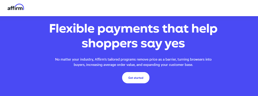
The first example comes from Affirm, a financial technology company that lets online shoppers buy things now and pay for them later. What's so great about its sales page, which is made for people who want to sell things online?
On this page, Affirm did a lot of things right, such as:
- Many online businessowners have the same important goal of getting more shoppers to "say yes" and make purchases.
- By putting up the logos of well-known brands that use Affirm, they can build their credibility.
- Data to back up claims that it increases the average order value and the number of repeat purchases
- Giving space to Affirm's most important features, like its "premium network of over 6.2 million shoppers," and pointing out the benefits of those features.
- Answering questions like "Will this work with the tools I already have?" and "How does it work?"
All of these are methods you can also use to make your sales pages work better (and landing pages in general).
AdEspresso University
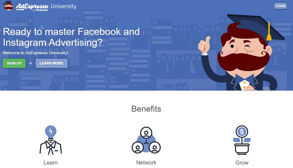
AdEspresso University's sales page is also worth taking a look at. What is it good at? On this page, you can:
- Even though the heading is simple, it is interesting because it is a question and because it relates to a real need of AdEspresso's core audience.
- The benefits of the school should be listed right away and above the fold to get the reader's attention.
- There are also testimonials and a video further down the page that back up the benefits listed above.
- A list of each part of the university, what it offers, and what kind of value visitors can expect when they sign up.
- Repetition of a single call to action: "Don't Miss Out! Only $19 a Month!" with a Subscribe Now CTA button.
This sales page shows that you don't need to use fancy words to convince people to buy something. Simple and straight to the point works as long as you put trust, transparency, and the main thing you want people to do first.
Monday
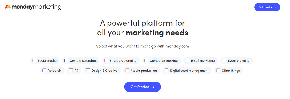
Last, we'll look at a sales page for Monday that is short but well-done. What does it teach us? The copy for Monday works because:
- The headline talks about a strong desire (not wanting to use a million marketing tools)
- Right away gives a reason to believe that it can meet "all" marketing needs.
- Explains key features and their benefits, including emotional benefits like "gaining confidence in estimating future costs" thanks to time tracking.
- Credibility is built by showing that big brands, agencies, and influencersare already using Monday and by sharing testimonials from other users.
- Only one clear CTA is repeated: "Get Started."
Stop Fighting Food
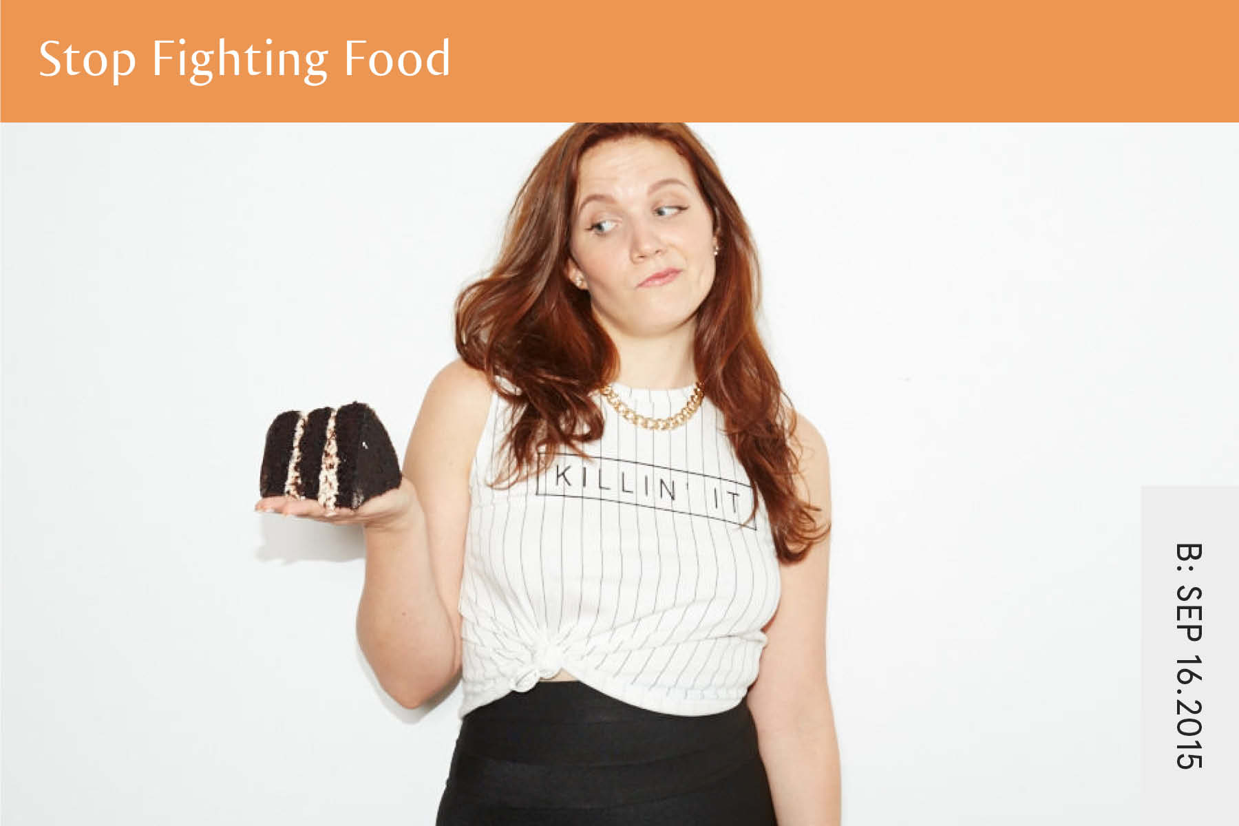
Don't try to stop people from selling food. Stop Fighting Food by Isabel Foxen Duke is a masterclass that teaches people how to eat well and think positively about food.
- Headlines and descriptions that are bold and written in the same language as the audience make the contenteasier to understand.
- The red pops in the same color scheme draw attention to important information.
- Bullet points talk about the reader's worries and show that you understand their struggles.
- The sales page answers readers' worries by giving them a simple way to deal with them.
- Real-life experiences shared in the video and written testimonials increase trust in the masterclass.
- The "Call to Action" has a clear design element that makes people stop and think about what they should do.
Live Off Your Passion

The goal of the online course Live Off Your Passion is to help people find and do more work they love. The images on the sales page are powerful and can be related to anyone who wants to find their passion.
- The short but detailed video is a great way to get a feel for the whole course.
- Almost all of the text on the page is about the problems that people have, which shows that the writer cares about the reader.
- It comes with a strong money-back guarantee, which can make people more likely to buy the course.
- Case studies show how people who have taken the course have changed their lives, which has made them more trustworthy.
- Having a lot of detailed testimonials helps to prove that the course is good.
- The FAQ section is easy to understand and answers any questions that potential customers might still have.
- Users have a lot of chances to convert when there are a lot of CTA buttons.
- Users are more likely to click on links that are personalized.
Digital Marketer
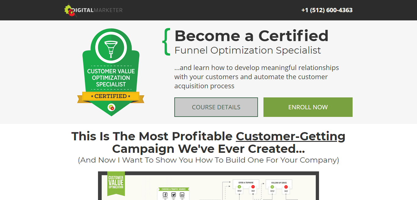
This example of a sales page from Digital Marketer is meant to get people interested in becoming certified funnel optimization specialists. Even though this is a long-form sales page, it does a great job of leading users down the page and convincing them to convert.
- The headline and subheadings give the reader value by telling them what they will learn and accomplish by taking the course.
- With bullet lists, the page makes it easy for readers to quickly see what the benefits are.
- The sales page copy is easy to understand because it is broken up with images and subheadings.
- Many CTA buttons work together to get people to take action.
- Having a section for frequently asked questions (FAQ) helps answer any questions before the course begins.
- Because there is no navigation menu, there is no way to leave the page other than to close it.
Elements Of A Beautiful Sales Page
Teachable makes it easy to make a sales page. Our plug-and-chug editor helps you make a professional page that is proven to convert, no matter how much experience you have. Even though our sales page editor is pretty template-based, you can change a lot of things to make the sales page of your dreams.
From colors to graphics to the type of text and other things. Giving your sales page the care it needs can go a long way toward making your customers happy. There is a simple formula you can use to get the most out of how your sales page is put together.
The Winning Formula
- Headline/hero: This is one sentence or a few words that explain what your course is about.
- Course Description: This is where you can explain in a few paragraphs what your course will be about and who it is for.
- Case study/testimonial: Testimonials help build your credibility by showing that other people like your online course.
- Call to action button: A "Call to Action" is just text that tells your audience directly to buy something. A CTA is something like a big button that says something like "buy now."
- Instructor bio: People want to feel like they know their instructor, so make sure to fill out your bio and let your personality shine.
- Case study/testimonial: Another case study or testimonial can really give people the last push they need.
- FAQs: People will have questions, and it's better for you to answer them all in one place than to spend an hour a day answering questions in emails.
Of course, these should only be used as ideas. Make sure that your sales page fits your brand and style.
How Long Should A Sales Page Be?

How long should your sales page be?
Some people say that short sentences are always better. Even though it's often a good idea to be brief, sales pages often need to be long. A sales page needs to give potential buyers all the information they need to decide to buy.
So, they may need a lot of information before they feel comfortable buying, depending on your prices, how familiar they are with the kind of solution you're offering, and other things. If you don't give them what they want just to be brief, your conversion rate will go down.
In other words, a sales page can and should be as long as it needs to be to have the desired effect. Instead of focusing on a certain word count, you should try to get the value of your offer across in a clear and thorough way.
People Also Ask
What Are Sales Pages?
A sales page is a separate page that was made with one goal in mind: to get people to buy your product. Depending on your industry or niche, the product or service you sell on your page can be different. But the goal of your sales page will always be the same: to turn visitors into customers.
What Are Good Sales Pages?
With the goal of making more sales, a sales page is made. It makes people want to buy what you're selling. A good sales page is clear, to the point, and has everything you need to know about your brand in one place.
Why Is A Sales Page Important?
Your business starts with your sales page. It's where your leads decide whether or not to buy your product or service with their own money. Most of the time, sales pages are your last chance to win over a lead, so the stakes are high.
Conclusion
With the goal of making more sales, a sales page is made. It makes people want to buy what you're selling. A good sales page is clear, to the point, and has everything you need to know about your brand in one place. Use these sales page examples as a guide to making a design for your sales page that works like a charm for your audience.